Emploee Engagement Platform: Merchant, Employer, Employee and Admin Pannels
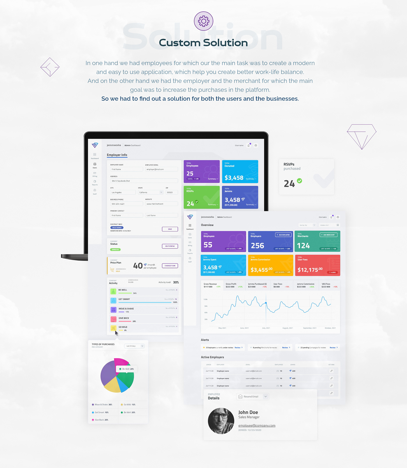
In one hand we had employees for which the main task was to create a modern and easy to use application, which help you create better work-life balance. And on the other hand we had the employer and the merchant for which the main goal was to increase the purchases in the platform. So we had to find out a solution for both the users and the businesses.
For this purpose we used competitor analysis and task analysis to make sure we have covered all the necessary features.
``I was beyond impressed by the modern, beautiful, easy-to-use platform that Deploee created for us. Deploee’s clear communication, problem-solving skills, speed of delivery, reasonable rates, and mind-blowing results have guaranteed we’ll never work with any other software developer.``

Task Analysis
For the task analysis we have made a couple of topics to cover: Onboarding: making sure that the users understand the idea of the platform from the very first step and that’s the onboaring. Searching for activity: making sure that the categories are clear and the users find exactly what they have expected. Purchasing: making sure that the steps on the purchase process are easy to follow. Vouchers: making sure that the users knowing where to finding their vouchers history (purchased and redeemed and purchased andyet not redeemed) and making sure to notify them for making their life easier.
Competitor Analysis
For the competitor analysis we decided to focus on GroupOn as our main competitor (+ it is also based in America, so the users there are used to the patterns). And of course we’ve used some similar bulgarian websites for group shopping. We didn’t have much choice because our budget was limited and most of the apps for employee engagement were paid, so we had to improvise.
HotJar Video Sessions
After launching the Merchant & Employer panels we had access to hotjar sessions from real onboarded users. So it was really helpful to watch how the users navigated through the design. We had the opportunity to find a lot of UX issues without spending extra money for usability testing.
Foundings about Volunteering
So at first our stakeholders decided that at the end of the month we should make the unused jemms go for charities. But after some research we found out that this is not such a good idea.
Unused Jemms shouldn’t go to Charities: If the users don’t use their jemms that should be a clear indication that they don’t use the APP enough and this is bad for everybody.
Foundings about Give Back Categorie
In the beginning of the project the Give Back category was like any other category where you are buying volunteering activity but also receiving volunteering points at the end. After some research however we found out that:
Give Back should NOT be taking jemms: Lots of people from the unmoderated usability test said “Why should I pay for something that I’m volunteering”.
