Brief
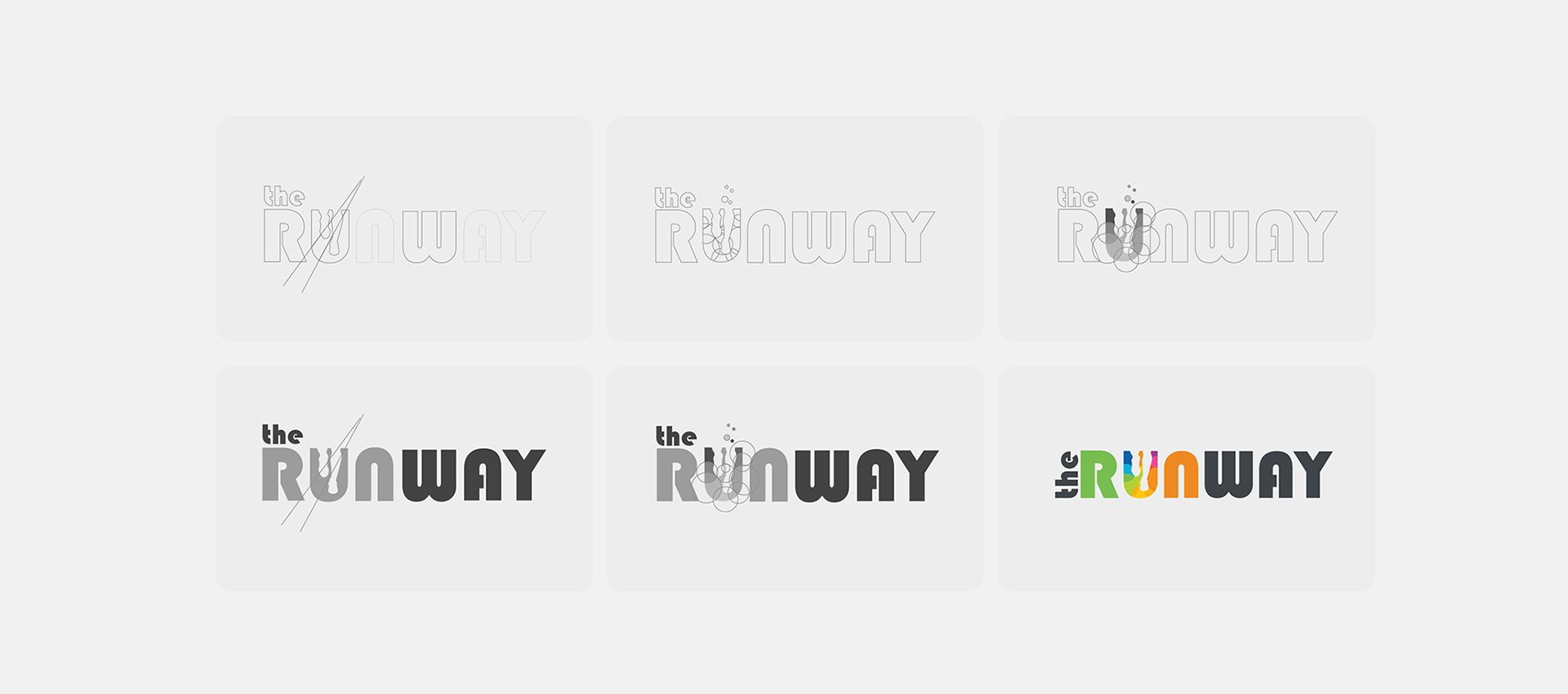
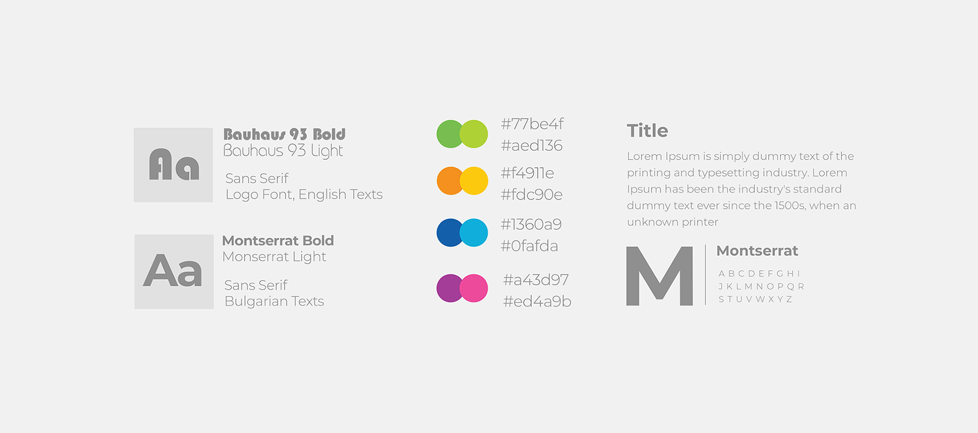
For the name I decided to choose something with “run” on it. Next step was to pick a proper font style – my final choice was Bauhaus ( with 2 styles: Bold & Light ) because of the curves of the letters, that remanding of a track field.
Choosing the colors
I needed multiple colors because it gives more options when it comes to other designs for future advertising. The colors had be soft and easy to use as a backgrounds in future designs.

Inspiration
I found the logo of Cosmos, I liked the idea with all of the colors to be in just one letter. This was keeping the simplicity of the logo but also adding it’s own identity.
The other part was making the logo easy to implement on a web page. I think that the logo should be with smaller height and bigger width. With these proportions it looks best in the navigation bar or a sticky menu. That’s why I decided to bring “the” in front.
Web Design
I’ve developed my own e-commerce online store at the beginning of 2018. It was just a personal project that I use for education. I had a lot of fun in the whole process – from creating the logo to designing the website.
Associated with the project:
• Influence Marketing • UX Design • Brand Strategies • Digital Design • Storytelling • Engagement• SEO & Digital Marketing
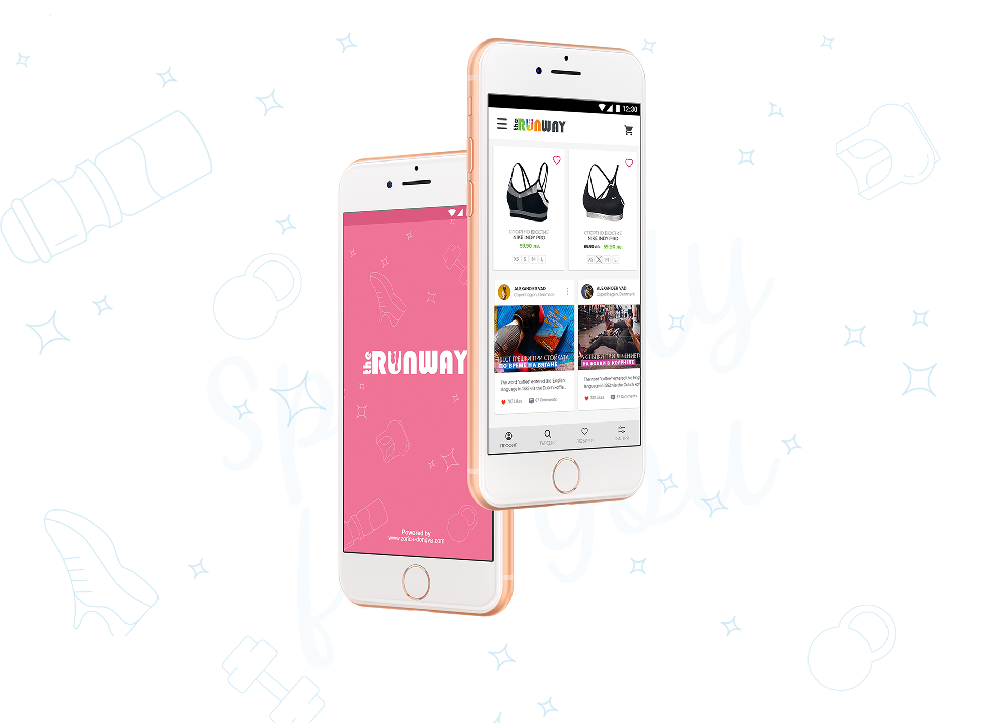
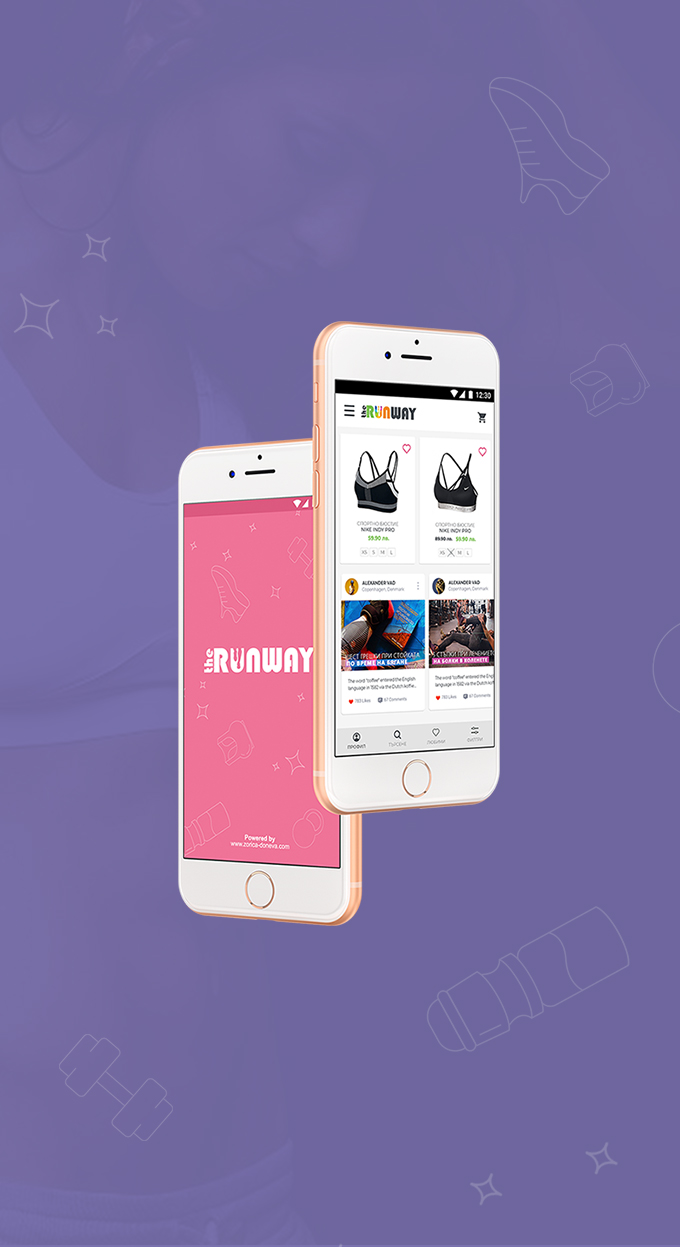
I’m currently working on designing an application for the shop, just for the fun. I think that personal projects are really important for us. It’s the time where you can show your work without the reflection of the clients feedback.
