/ Info
Problem & Solution
We had to ensure that the design is usable if we wanted the product to be successful. The increasing of the active buyers was our main OKR and it was our main metric for success though out the whole time. Utilizing design thinking techniques in our work, such as competition analysis, user research, prototyping and usability testing helped us develop greater empathy, establish the proper challenges, and ultimately come up with the right solutions. Here some of the metrics that were our guide to make sure we are on the right track:
/ Usability Testing
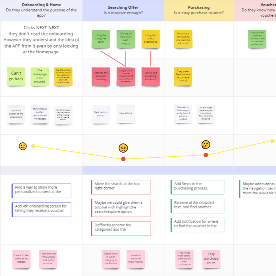
Journey Map: For creating tasks for the usability tests and making sure we cover all the steps in the user flow process.
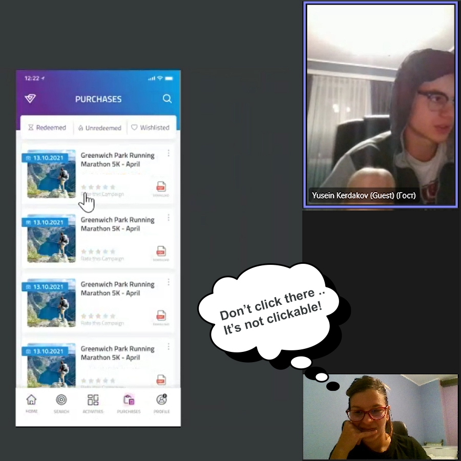
Moderated Usability Test: The recruitment process was easy because we just needed employees of any kind. We used 3 participants for moderated usability test to creating the first Maze.co prototype and one pilot test with a co-worker to make sure everything works as expected with the test.
Unmoderated Usability Test: We’ve launched fully polished unmoderated usability test. With more than 20 participants involved. We were utilizing the free plan, which was a dilemma because I had to limit myself to just 10 questions and without conditions.
/ Key Insights & Readout
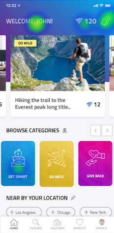
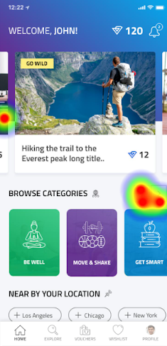
People don’t find what they are looking for.
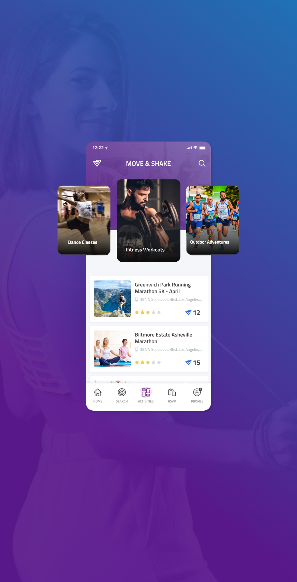
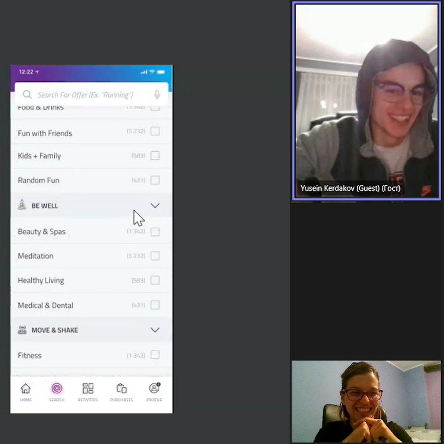
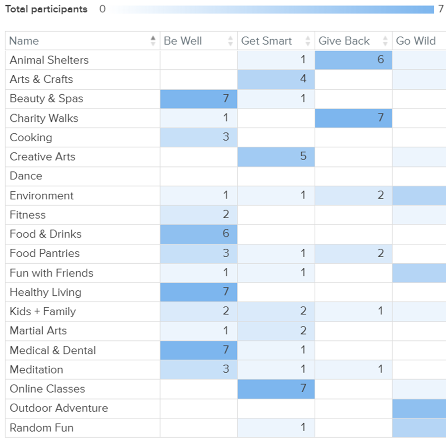
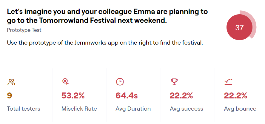
We learned that we need rename the categories and subcategories. Card sorting was really helpful to us in this case. In the first itteration before the user finds out the event from the task, there was a lot of back and forth movement. It took them about 90 seconds to finish the task.
/ Key Insights & Readout
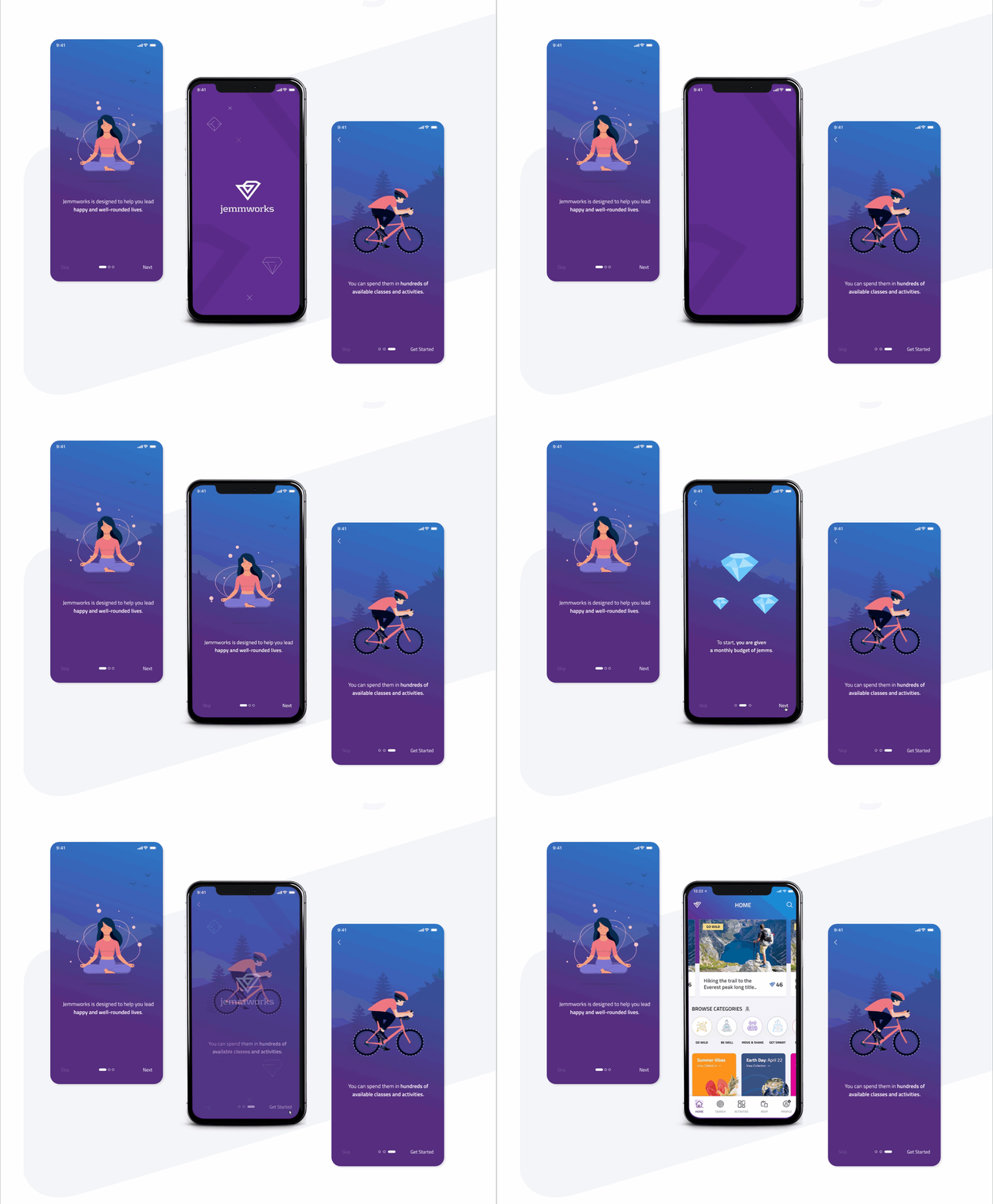
They don’t see the search icon at the bottom
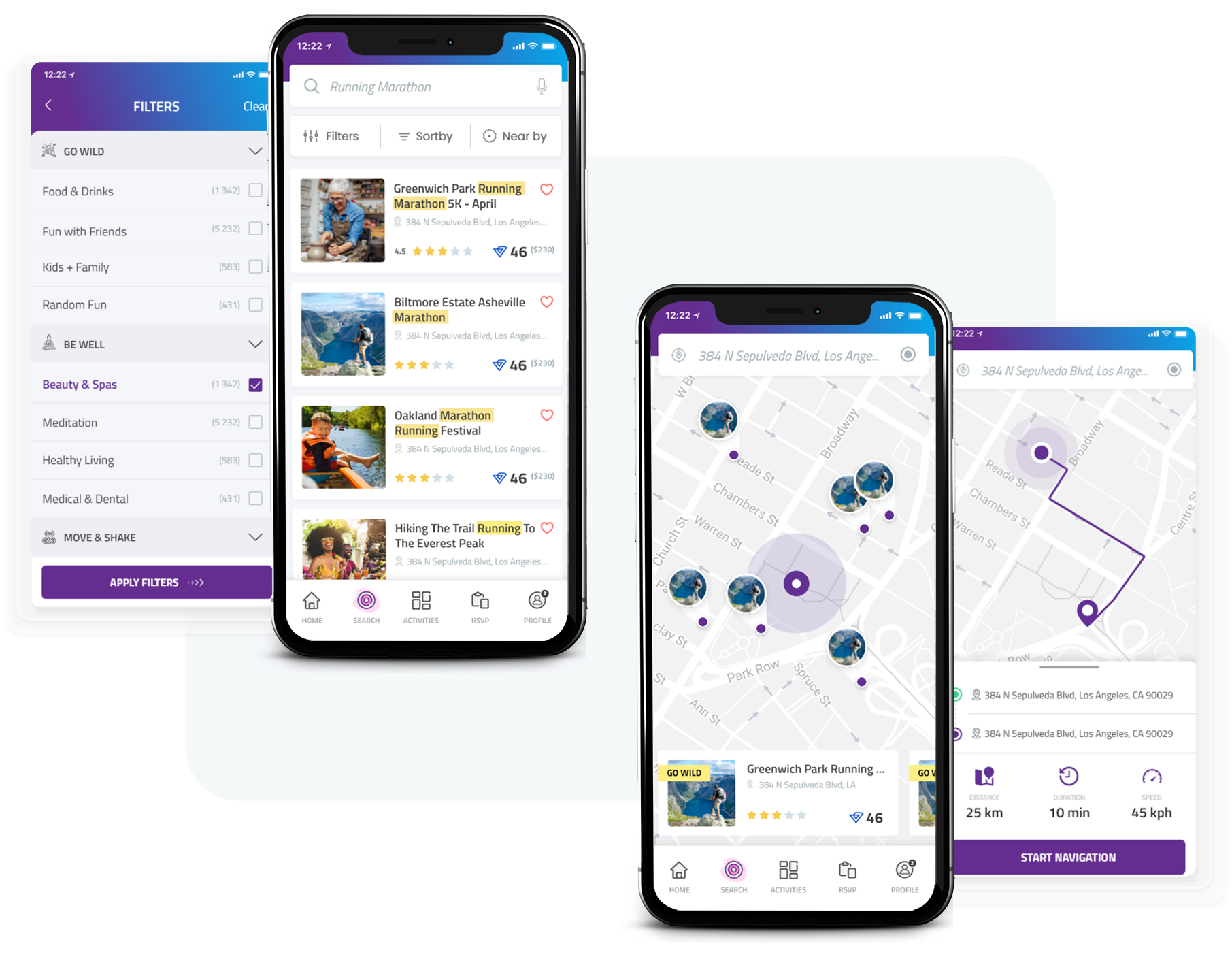
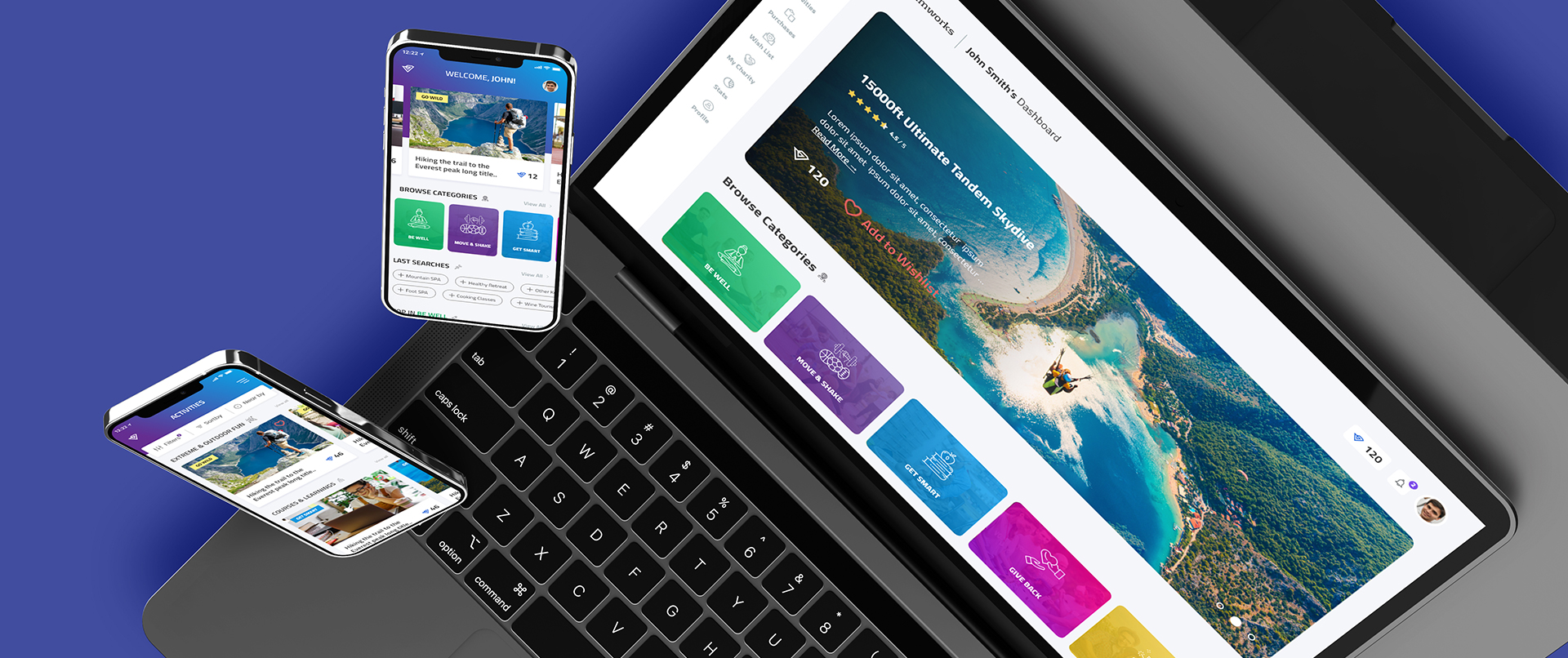
We should figure out how to encourage users to use the SEARCH feature. They don’t appear to have noticed it on the navigation bar. They might be accustomed to seeing it at the upper right corner. Perhaps the search should be located in the top right corner and the notification icon should be moved to the navigation bar. Consider conducting some A/B testing to see which choices users prefer..
Quote from Testing: “I think a search would be really helpful since I didn’t knew that category the festival will be listed.”
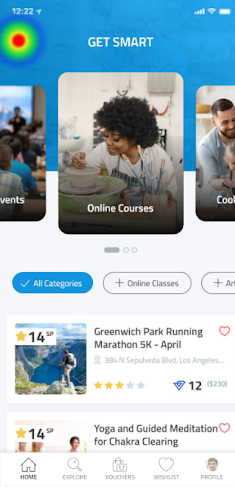
There should be a way for selecting multiple subcategories for searching.
Example: Festival could mean different things for everyone. It could be: Dance; Fun with Friends; Kids & Family; Random Fun;
Merchant should have a way to add one offer in multiple categories. Or at least some kind of suggestion based on the title written. (second screen example)
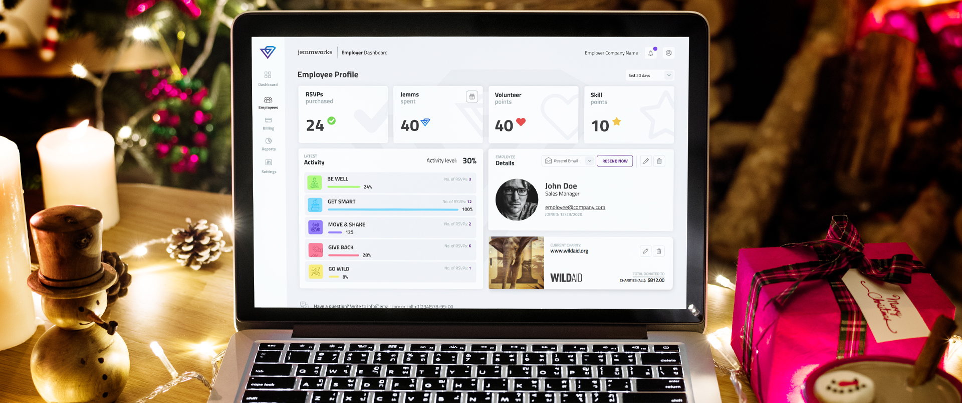
Since the employees have difficulties with categories and subcategories the merchants will probably also have some difficulties in deciding where to put their offer.
