/ Info
Problem Statement
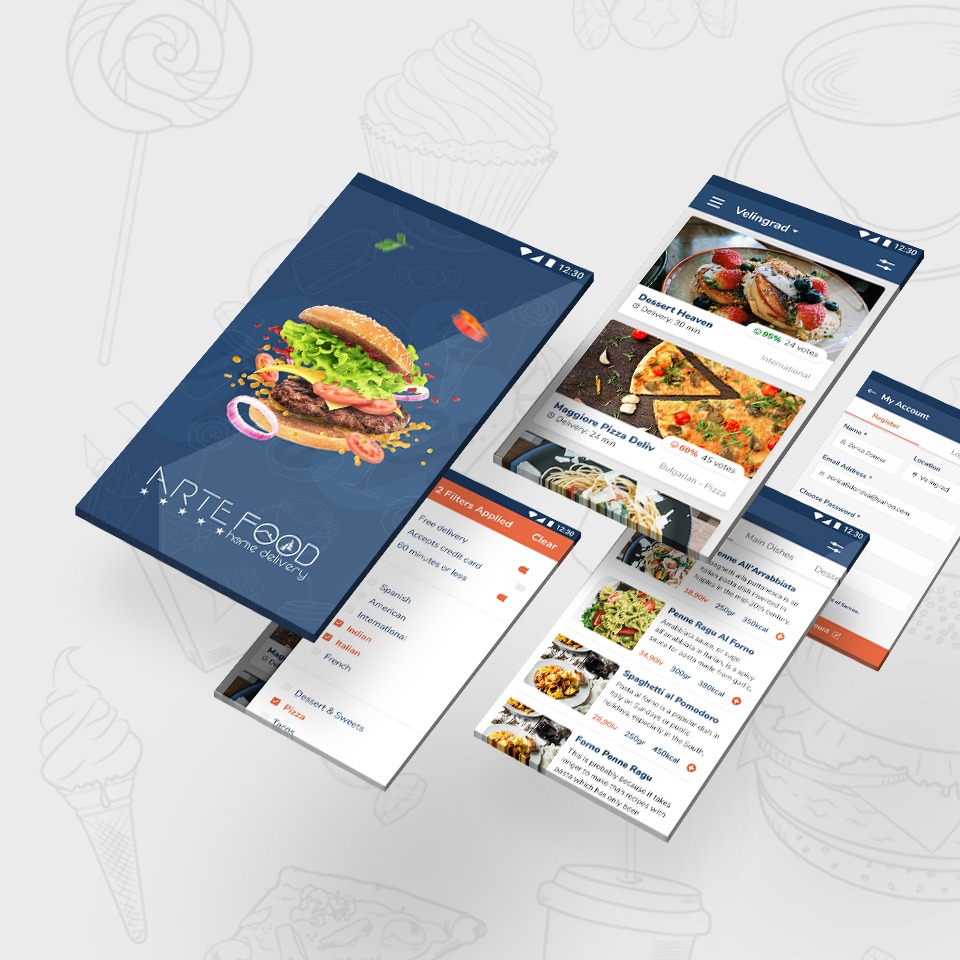
The Arte Home is a product inspired by people who try to manage their health life but are too busy. We’ve realized that there is not enough food delivery services in our location. Even the big competitors such as Take Away didn’t offered much. With such a small competition in the industry, we saw a big opportunity for the business. We’ve also wanted to bring value to the people we’ve targeted, so our idea went beyond just food delivery.
Solution
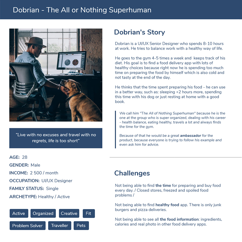
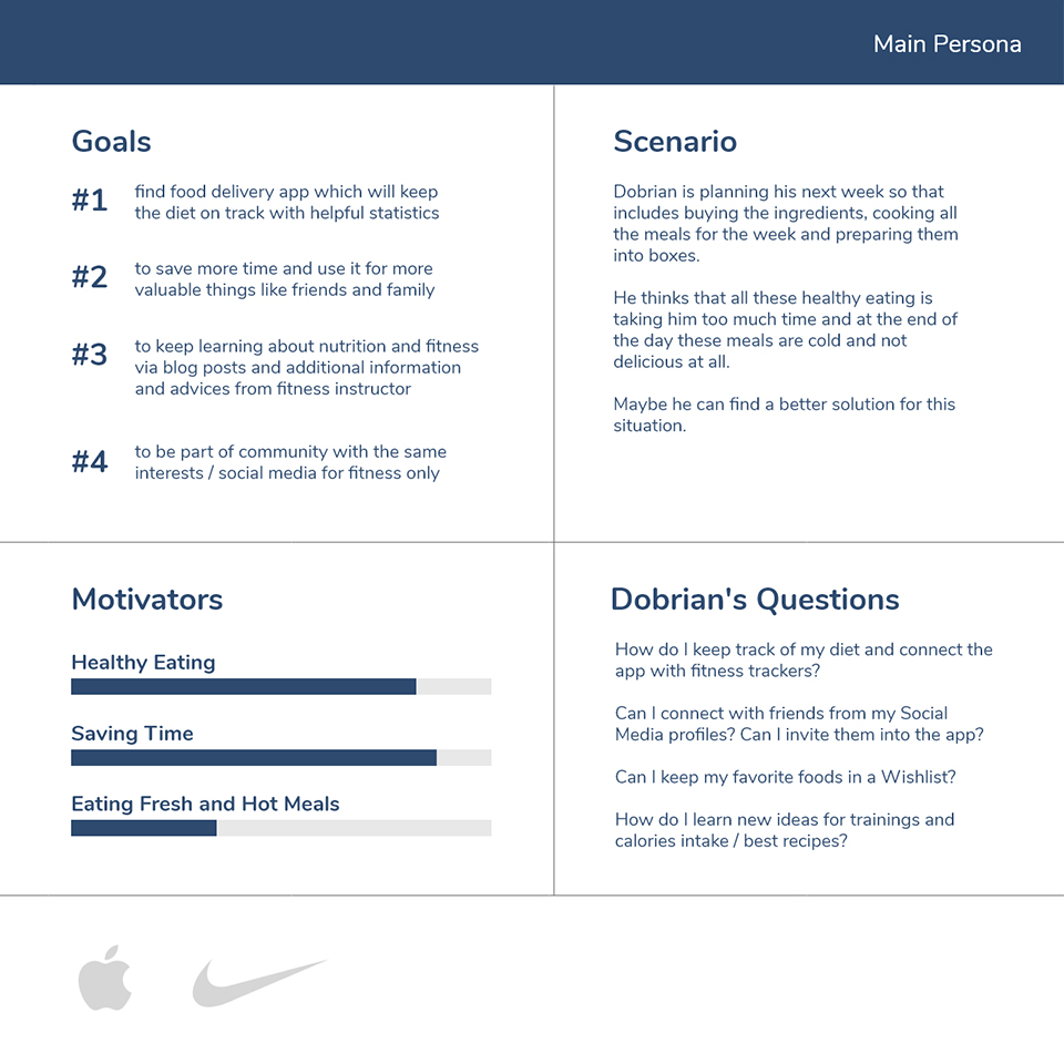
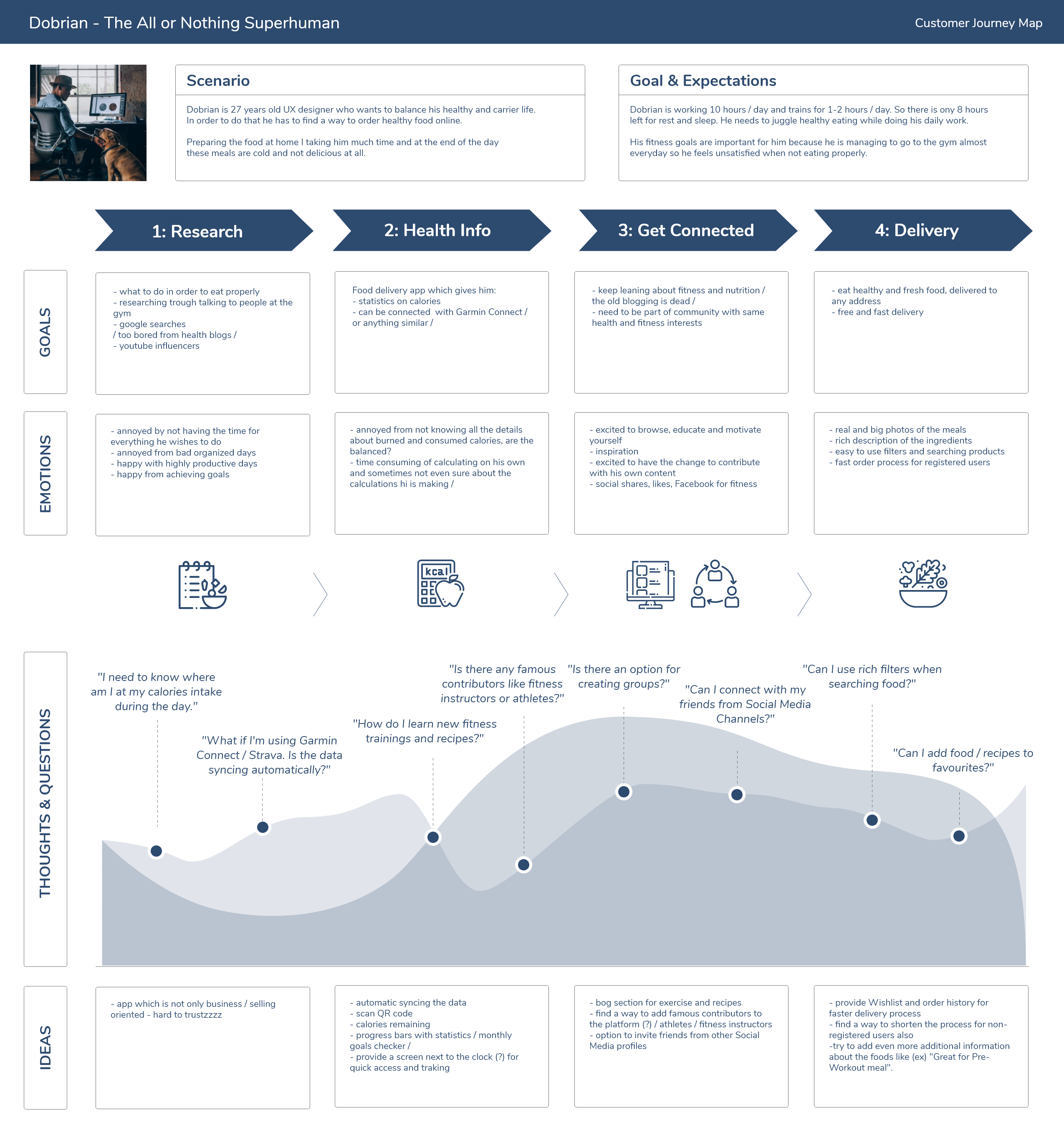
I have worked on the design based on the design thinking methodology, which includes 5 stages: empathize, define, ideate, prototype and test. We eventually delivered not only fully functional app for healthy food delivery but also the emotional value people are looking for. I conducted competitor analysis, task analysis, user research, key personas and user journeys and finished the design with creating interactive prototypes.
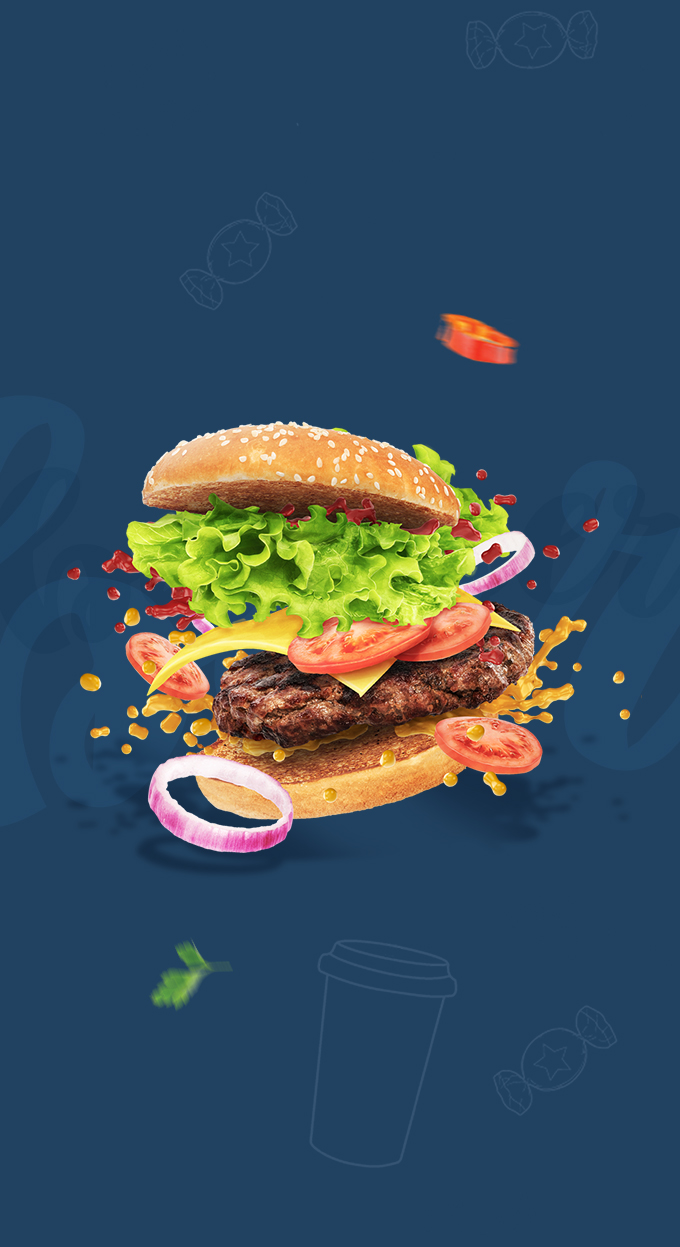
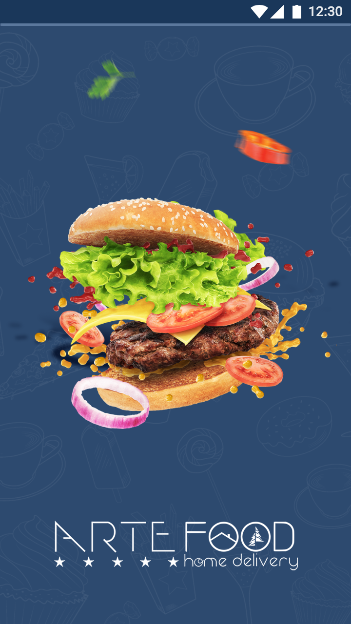
/ Onboarding Screen
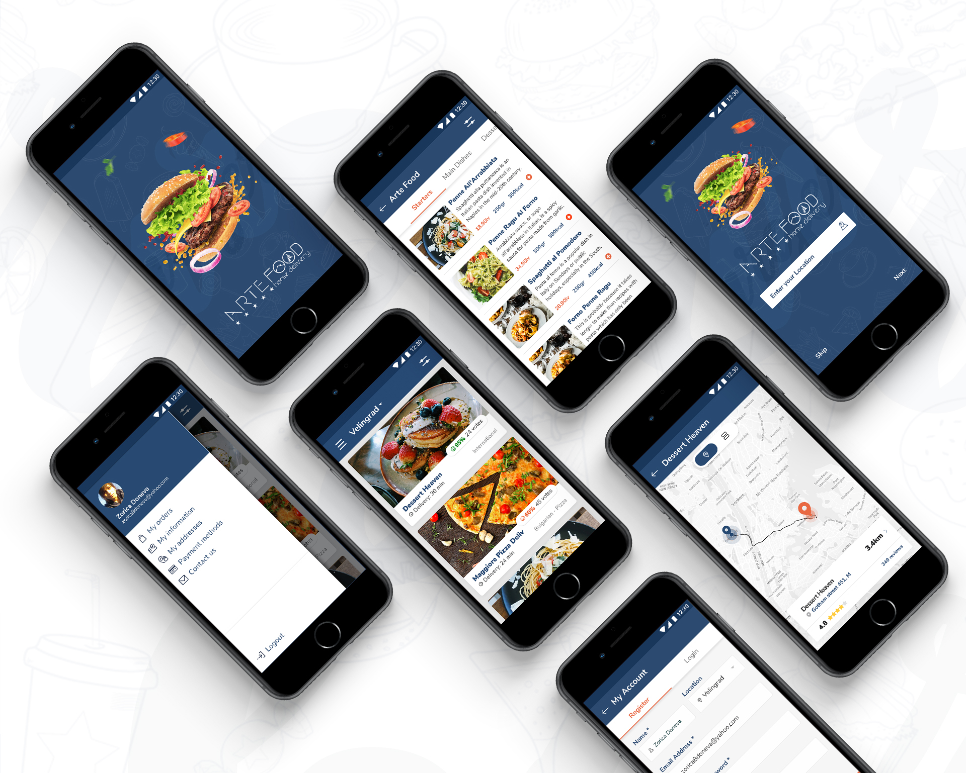
Because of the low budget we had, we could not afford user interviews. That’s why we had to find another way to understand the user. We developed a rich understanding of our users habits and problems by using already analyzed and proven UX patterns.
Quote from Survey: “I felt very obtrusive because it doesn’t let me decide later and see what the app has to offer first. I just don’t have enough information to persuade.”
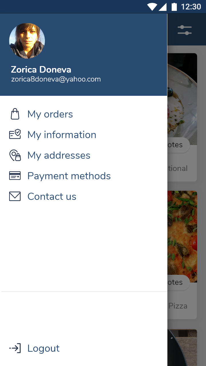
Тhat’s why the app can be used without registretion. Instead, we decided to give the user the opportunity to first try the app. The registration steps annoy a lot of the users.
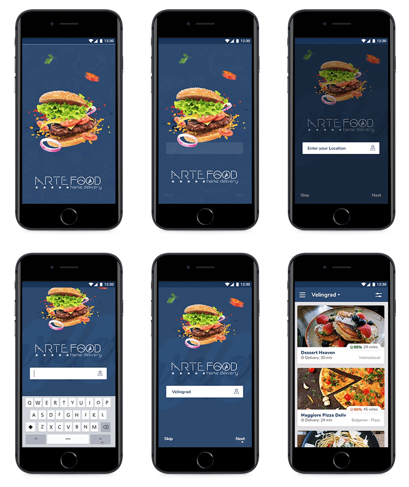
The only thing we need for a start is the location. Which could be taken with the GPS locator or manually – with typing city or an address.
We present that in a short onboarding instructions with highlighting specific areas. We wanted the starting section to be short, easy and simple. Of course in the future the user can take the time to make a profile or even faster – to log in with one of his Social Media profiles.
The animations and the loading indicator are just a small touch for making the screen good looking and providing the user with valuable feedback.
/ Style Guide
/ Competitor Analysis
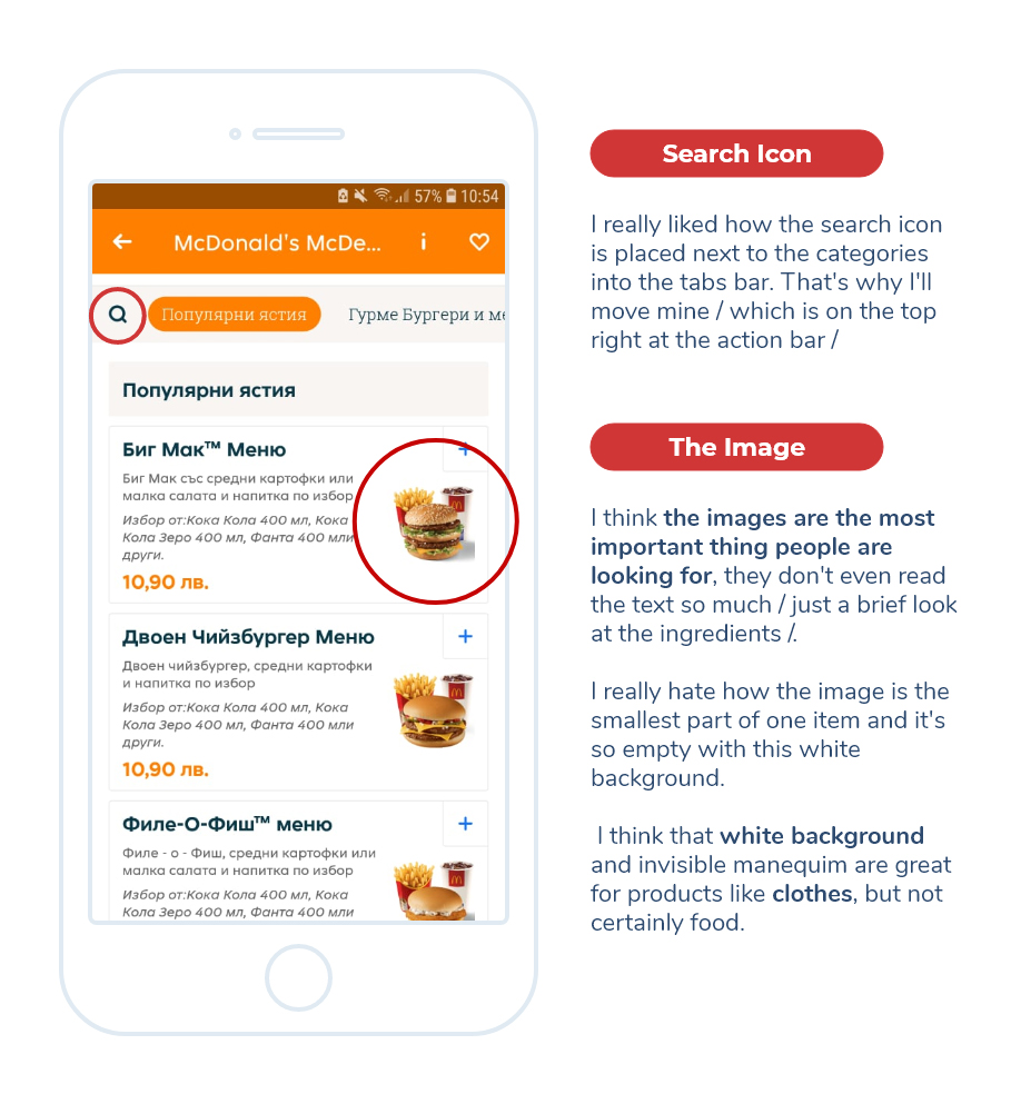
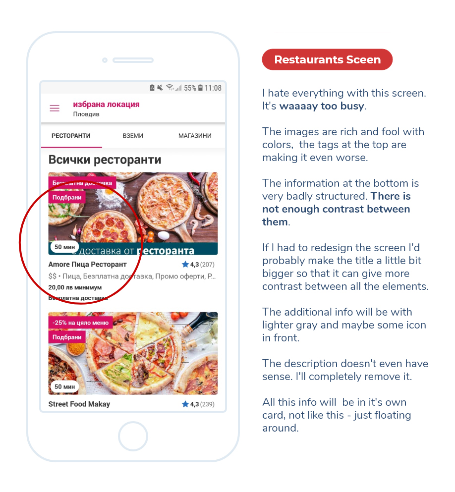
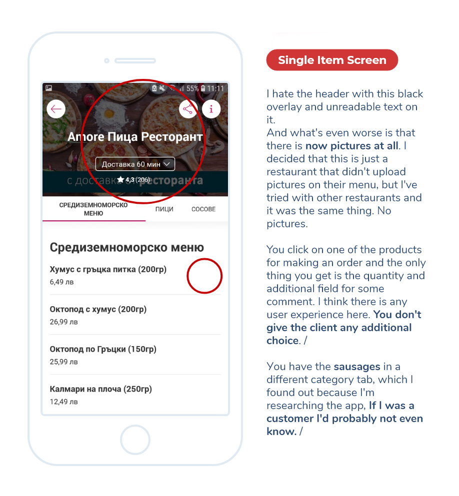
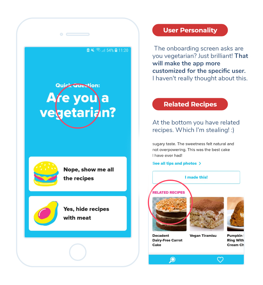
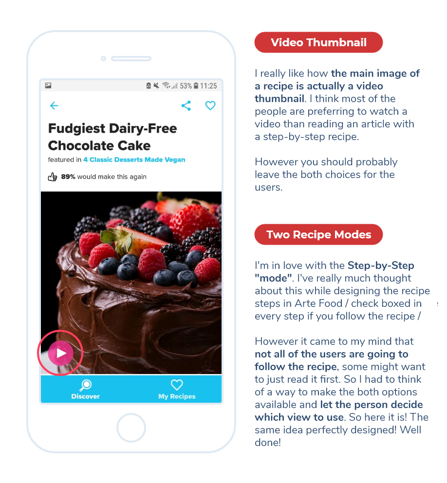
To begin my research I started to look at similar platforms. The key focus was to taking the competitors mistakes and make them our strengths. The main apps I’ve analyzed was: TakeAway, FoodPanda, Tasty.
Goals to achieve after the Research:
– Helping users make a decision in the best direction via ratings and user comments for social proof and credibility. Because we’re likely to converge on a course of action when others provide the action for us. – Now a days we don’t only need to find information, but also have the need to upload and share content. The growth of social media is the living proof of that. The idea of sharing something is extremely important for everyone. That’s way our app is designed to consume content and to share content as well.
/ UI Solutions
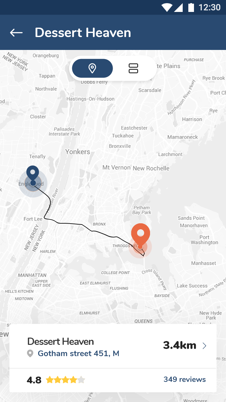
Task-Oriented: We’ve made the search field with auto suggestions to reduce user’s input, automatically fetching the users’ geographical coordinates instead of requiring them to input these manually.
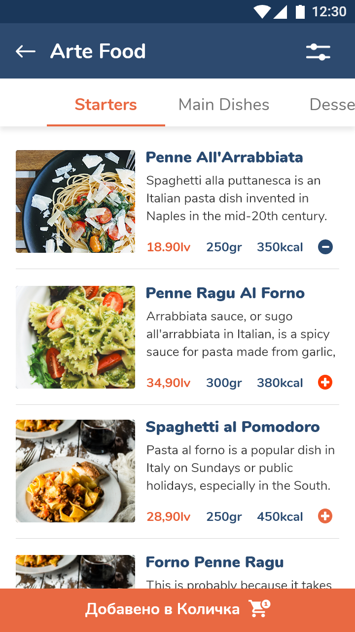
Understands the user’s environment: we’ve had in mind that the users might no be still, their location will varies, their ability to pay attention will varies, their connectivity may drop and they will probably hold with the device with one hand. Having in mind The one Thumb, One Eyeball Test we decided to make all the buttons stuck at the bottom.
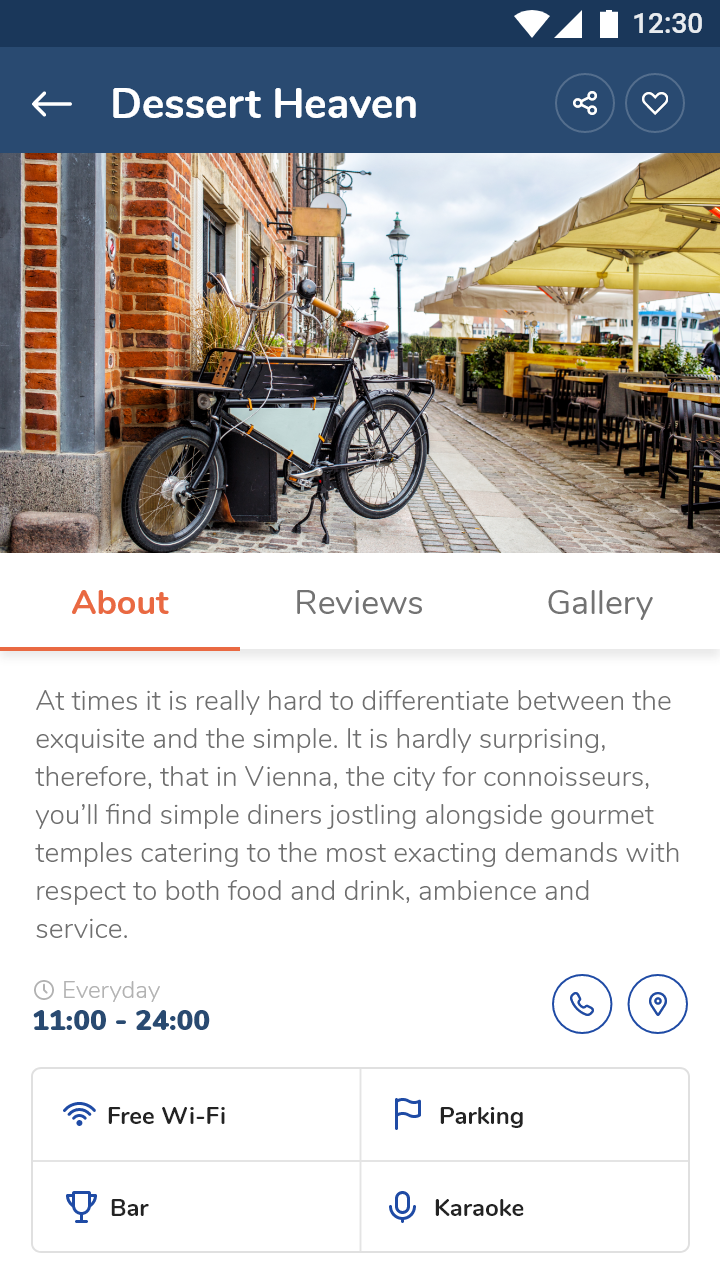
Their time sessions are going to be short and limited (for instance paying attention to the road while walking). That’s way we separated the content into small sections and only showed a small snippet first, because the interaction is likely to be interrupted at any time.
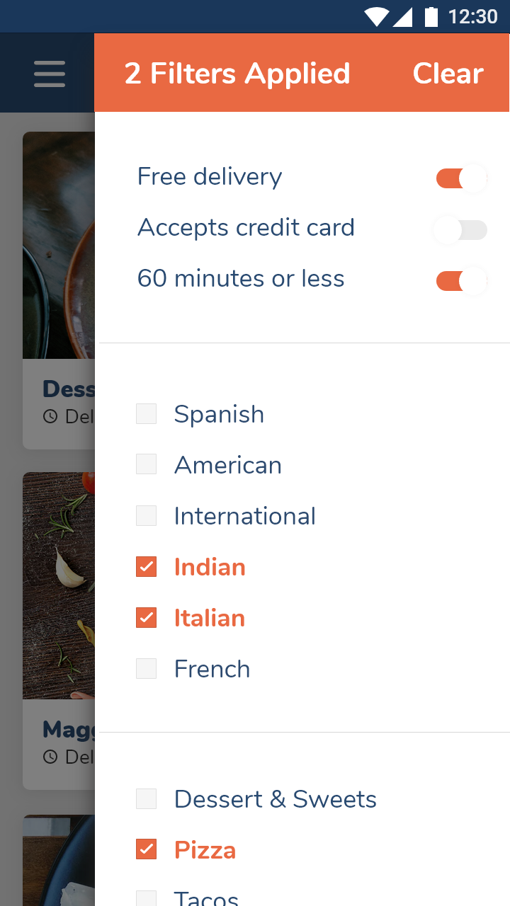
We had to make sure that: 1) the filtering process includes everything that a user will need; 2) we fit at least 3-4 products at above the line section; 3) the Buying Process had to be short; 4) the we have an after-purchase period, where the customer could share their experience in the comment section.
